Visual and Analytic Work Samples
My scientific background has given me a strong foundation in explaining concepts and interpreting large amounts of data. I believe I have further developed an ability to take raw data and translate them into strong graphics. Some examples of larger research projects and smaller graphics are below.
Who Owns Texas? Poster
I created this poster and presented it at the Southern Demographic Association (SDA) Conference in San Antonio in October 2023. Click for the full PDF.

Click to zoom
Practice / Works in Progress / UTSA R Learning
I have been learning how to conduct research in R through my PhD program at UTSA. The program R has vastly transformed how I access and map Census Data, and allowed me to use other large data sources such as iPums, LHED, and others. All of my statistics courses at UTSA have been taught in R, covering regressions, principle component analysis, advanced spatial statistics and other techniques.
See more examples of my work in R at this link.
Learn more about Figures 1 and 2 (a typology analysis of San Antonio/New Braunfels Metro Area using K-means clustering) at this link.


Frontline Workers Analysis by Race and Income, UTSA Poverty and Inequality Course, Spring 2020
As the pandemic was beginning to take hold in spring 2020, I was in a class titled Poverty and Inequality with 6 other classmates and our professor, Dr. Joachim Singelmann. We decided to examine the race and income of frontline workers through an analysis of iPUMS ACS Microdata and coding different occupations by whether we believed the persons working those jobs would be able to work remotely during the pandemic. While we all played a role in coding, downloading, and examining the data in R, I made the below chart in Excel looking at disparities by race, income, and gender. More about this project can be seen at NIUSSP.

Replicating NYT Single Family Zoning Analysis for San Antonio
The New York Times analyzed several cities for the amount of land they have zoned solely for single family housing, or other types of housing allowed. I replicated this analysis for San Antonio, shown in the map below, and compared it to the cities the NYT analyzed in the graph below. Their original analysis can be found at this link.


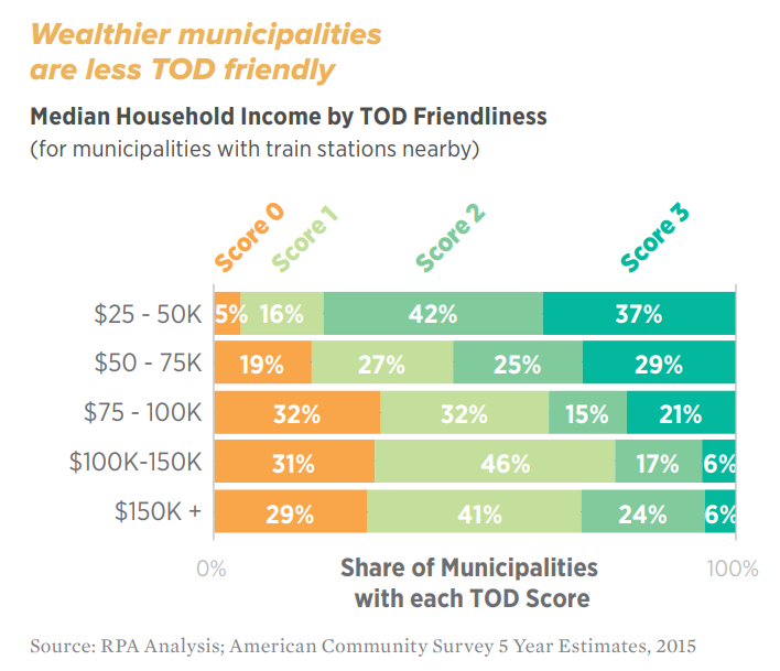
Transit-Oriented Development (TOD) Friendliness for the Region's Rail Stations
From Untapped Potential: Opportunities for Affordable Homes Near Transit RPA, 2017
This work is original analysis based on data collected by RPA which determines how multifamily friendly the zoning within 1/2 mile of the region's rail stations. Station Scores range from not allowing multifamily development at all (0), to allowing a moderate amount of density (3). Further density and correlations with race and income can be found in the full report, which also includes the build-out potential for all of the parking lots near these rail stations.

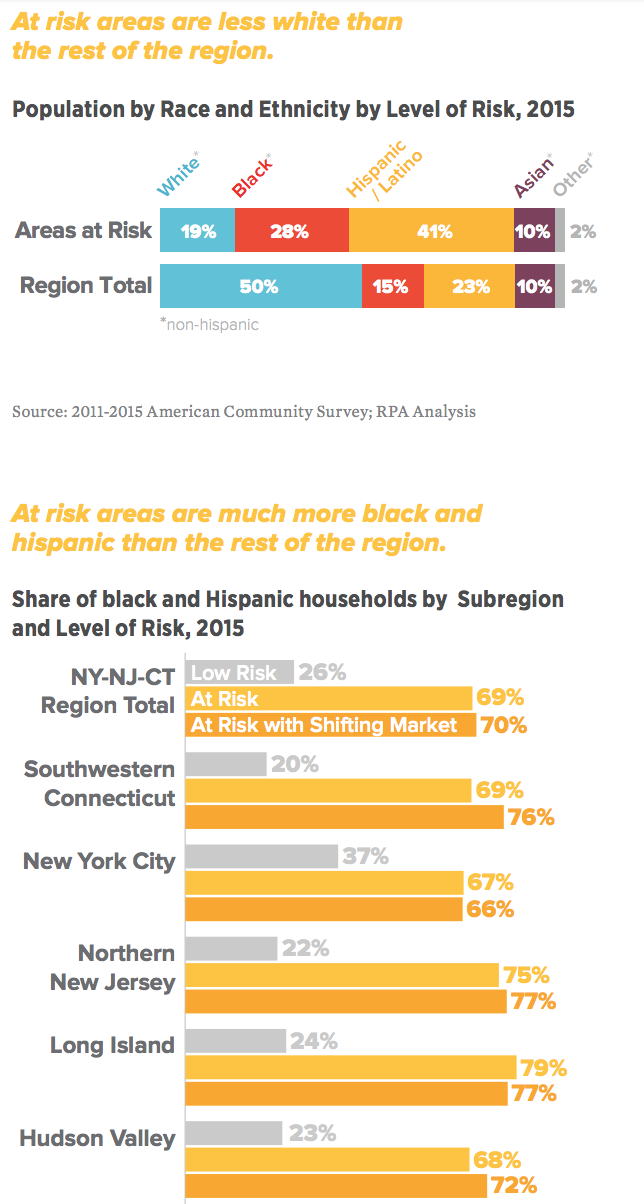
Displacement Risk Index
From Pushed Out: Housing Displacement in an Unaffordable Region, RPA 2017
Working with RPA's New York Director, we developed a predictive index for risk of residential displacement. Unlike previous attempts to quantify where gentrification is happening now, this index attempts to uncover where residential displacement due to gentrification is likely to happen in the future. The index is composed of three components: (1) economic vulnerability - low income renters and housing cost burdened households; (2) neighborhood desirability/access – walkability (Walkscore) and jobs accessible by transit; and (3) a measure of market shift, to attempt to find where within neighborhoods identified by the first two factors might be seeing the effects of gentrification now.

Announced rezoning areas compared to areas at risk of displacement.
From Inclusive City: Strategies to Achieve more Equitable and Predictable Land Use in NYC. RPA, 2018.

Segregation Analysis by Census Tract
RPA, 2016
Based on HUD's Fair Housing Equity Assessment (FHEA) methodology, I attempted to show the deep lines of segregation throughout the region in an easily digestible format. This map is also featured in a CityLimits article.
Employment-Driven Population Projections for Future Scenarios Process
RPA, 2016
From Charting a New Course: A Vision for a Successful Region, RPA 2016
While we were beginning the process around RPA’s Fourth Regional Plan, we devised population projections for the NY-NJ-CT region. I was heavily involved throughout this process, and developed RPA’s cohort component population projections. These were based on both employment projections from Moody’s Analytics (as an “aspirational” or “vision” scenario) and an adjusted projection based on “business-as-usual” if the region cannot build enough housing for population demand. Further methodology and results can be find in the report.


Historic Census Data Analysis of NYC and Williamsburg/Bushwick/Bed-Stuy, 1960-2010
Fall 2014

View PDF: New York City
View PDF: BK Community Districts – CD 1 (Williamsburg/Greenpoint, CD 3 (Bed-Stuy), and CD 4 (Bushwick)